Quick definition
They are different types of pop-ups. I’m only considering modal elements that cover the screen (usually with a black overlay). By doing so, the user workflow is abruptly interrupted; the user has to look at the pop-up to close it in order to carry on what he was doing.
Here is an example:
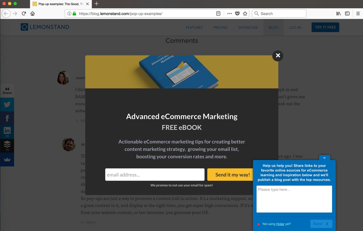
As a matter of fact, on that page; a feedback box popped-up at the bottom-right corner as well.
Why are pop-ups still being used?
About 10 years ago, everybody wanted a pop-up on their website. That was the new trend to increase conversion. Pop-ups are designed to interrupt your workflow; in other words, they are extremely annoying. That common sense idea seems to have gain momentum and it’s now rare to get that request from a customer but it sill happens. Why is that?
Conversion rate
The conversions is the only reason why pop-ups are still a thing. A quick google search and you’ll find that you can achieve a 11% conversion rate by using a pop-up ! See for reference this article: Sumo pop-ups statistics but keep in mind that Sumo does sell pop-ups…
Let’s say that you add a subscribe pop-up to your blog. The conversion rate would then be: how many visitors enter their email address out of a hundred? And guess what, it increases with the use of a pop-up. But that number alone is not enough to keep using pop-ups. The number of people that agreed to enter their email address is a dangerous vanity metric .
- First of all, what are we comparing that conversion rate to? To a simple subscribe button in the header?
- Out of the “converted people”, how many people just clicked on the email field - which was then automatically filled up by their browser - and then, pressed enter. It’s not that much effort after all. Would they then actually read the emails?
- More importantly, how many people gets annoyed by it?
- How “bad” does it look? How does that affect your brand image?
I’m just scratching the surface with the above questions. My point is that a statistic alone is worthless * .
Damage control
The decision has been made, a pop-up must be added to your website. Let’s do some damage control.
Use a cookie
Let’s start with the obvious. A pop-up is annoying but it’s tolerable if you only see it once. You definitely don’t want a pop-up to appear on every single page.
Don’t use multiple pop-ups
I’ve read an article the other day and 3 pop-ups showed up while doing so: one at the start, one when I scrolled down to the bottom and one when I left the page ! A single pop-up might be effective but there is no excuse to use multiple ones.
Timing matters
Pop-ups often appear on page load which means that users might see it before seeing any valuable information. You want the exact opposite to happen. For example, a user is most likely to subscribe to a blog after reading an interesting article.
Pop-ups can be added after some time or based on a certain amount of scrolling. That being said, it seems obvious to me that in that case, it’s good UX to add a subscribe button towards the end of an article - there is no need to make it pop-up.
Test it on mobile
My previous smartphone had a really small resolutions and I’ve left many websites simply because I couldn’t close a pop-up…
Look for alternatives
I personally think that you should never use a pop-up. I cannot imagine marketing nor UX experts using it. For example, I doubt there would ever be a pop-up on apple.com or smashingmagazine.com … You should really look for alternatives. Listen to your inner voice, unsolicited pop-ups are a massive pain and please remember: every time a developer implements one, a puppy dies.
Notes
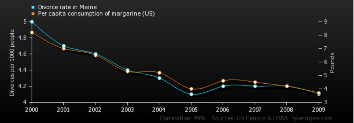
* this is completely unrelated but here is an interesting example of worthless statistics: