
Previous design
Here are 2 screenshots of what eatsomecode used to look like.
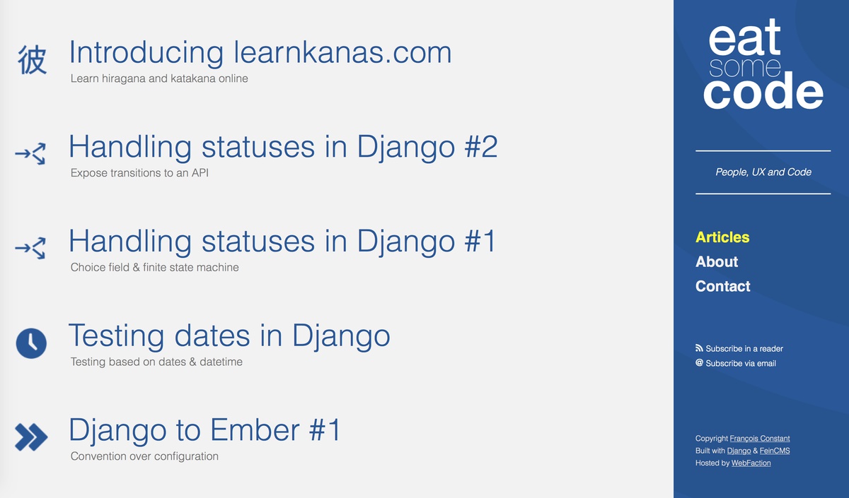
Homepage
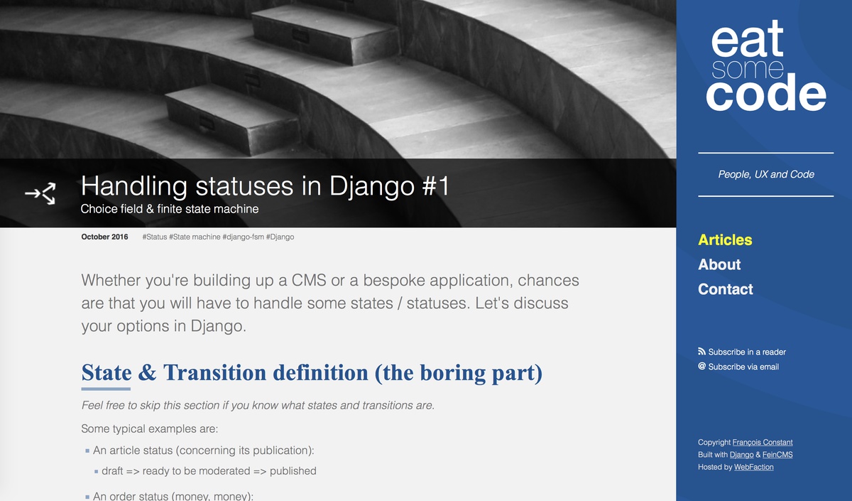
An article
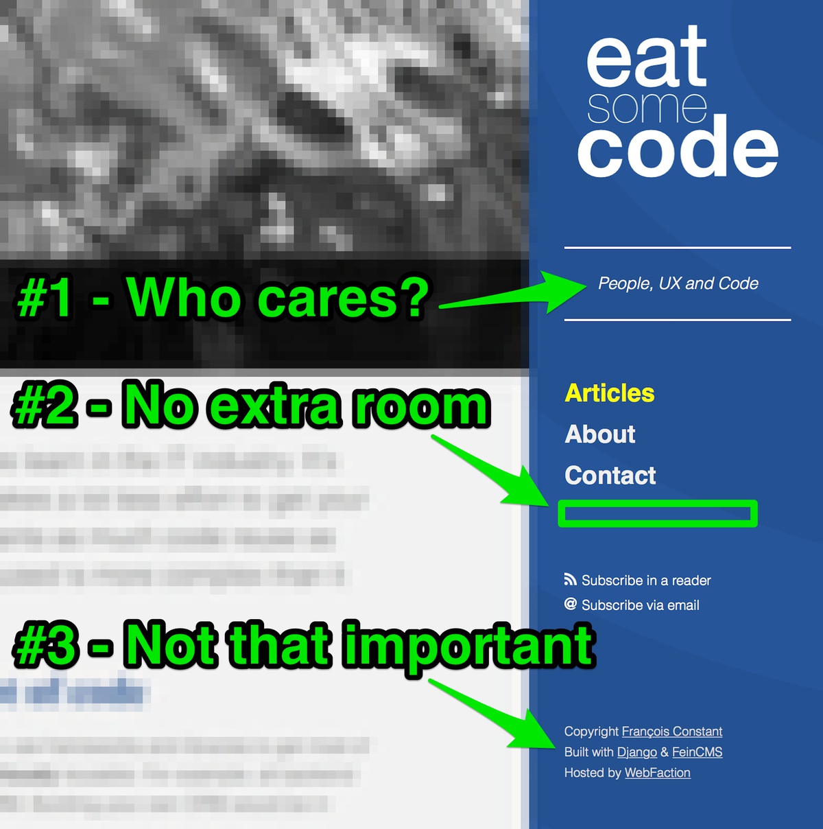
The issues
A picture is worth a thousand words:
Responsiveness
Nowadays, people use their mobile phone to read articles more than their laptop or desktop. The previous design (with the column on the right) wasn’t fit for mobiles. The website was responsive but to do so, I had more HTML & CSS than necessary (different menu for mobile). This is not a big deal but this time, I made sure to keep things really simple.
Secondary information
Having a tagline #1 was completely unnecessary. The contact link & copyright information #3 is fairly important but doesn’t need to be directly visible. People who want to contact me will be ready to scroll down to the footer. Now, having an actual footer allows me to put more links there without cluttering the website.
Size matters
The sidebar looks good as it is, but what would happen in future when I want to add something #2? For example, I might want to add a search bar and some extra links: projects, more ways to subscribe, sponsored links, etc. With a simpler design, this won’t be an issue.
The icons - a source of extra work
Playing with Affinity Designer is fun. As much as I enjoy the process, I’m not a designer - obviously - and preparing the article icons took me time (some were downloaded and just resized + coloured, some were custom made).
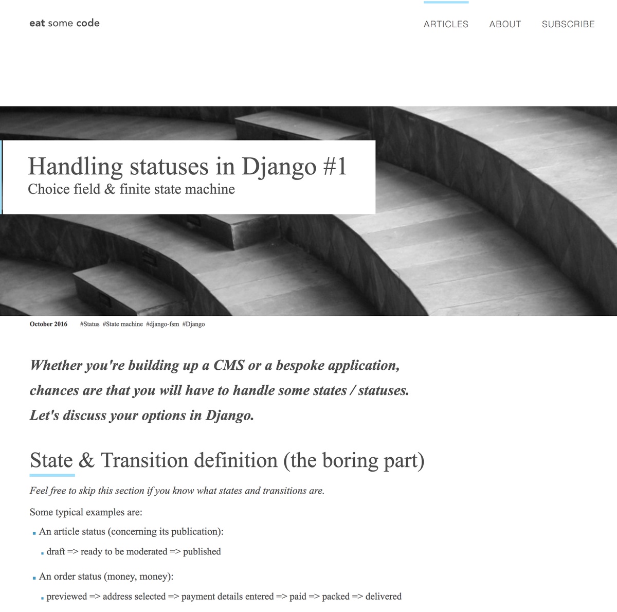
New design (as of December 2017)
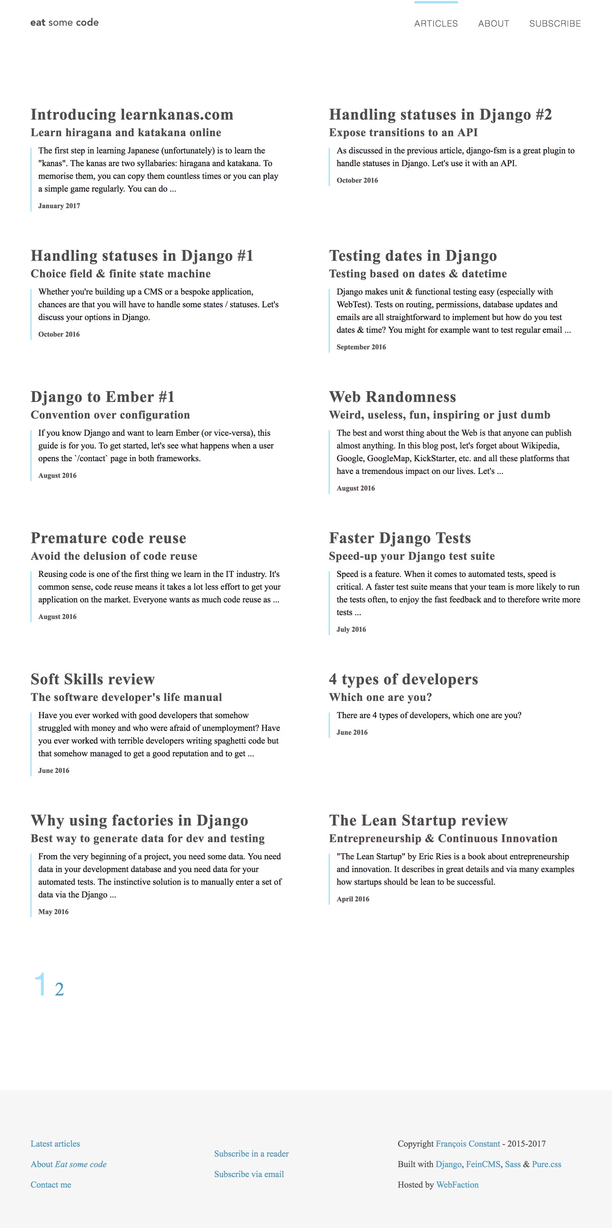
Homepage
An article
The morale of the story
As usual in IT / business / life: keep it simple.